ARIA Authoring Practices Guide
An essential resource to show web developers how to build accessibility semantics into web patterns and widgets.

The Challenge
Low Visibility and Usability Limit APG’s Impact on Web Accessibility
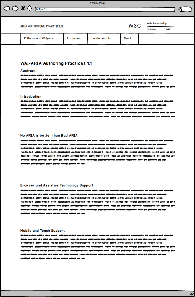
Since its introduction in 2014, the APG has been published as a W3C technical note, a format primarily intended for reading as a single, text-based document. Unnecessarily difficult for readers to consume and reference.
The Solution
Crafting a Intuitive, User-Friendly, and Discoverable Accessibility Resource
To address this, we reimagined the APG with a streamlined, user-focused design. I led the UX strategy, crafting an intuitive information architecture and a visually cohesive, accessible layout. This ensured that developers could more efficiently find and implement accessible UI solutions across projects.
Discovery
To establish a solid foundation for the design process and project approach, I began by conducting a series of interviews to define clear goals for the project.
Stakeholder Interviews
I engaged with the members of the APG Task Force to define clear goals and align with them on their expectations of success.
User Interviews
I conducted 9 interviews with APG users, including accessibility IT managers, engineers, web developers, and students.
Project Goals
During my conversations with stakeholders and users, we identified numerous issues but decided to concentrate on the four most critical ones.
Visibility
APG is currently a standalone document that follows the W3C’s Technical Report format and is accessible through /WAI/standards-guidelines/ under the Technical Specifications section. We want to make APG more visible by integrating it better into WAI and have a direct link from /WAI/Design & Develop.
Usability
The content’s format is a single-page document. It is overwhelming and easy to get lost. We want to make APG more usable by splitting up the content strategically and come up with a new information architecture.
Findability
To find content one has to navigate the site, scrolling or using the table of contents on the side. We want to incorporate a central navigation that provides easier access to the content and areas of most interest and make things easier to find.
Discoverability
The current single-page format doesn’t allow for serendipitous consumption. We want to be able to differentiate and promote certain resources we think most users don’t know about such as our section about how to provide Accessible Names and Descriptions.
Ideation
With our main goals in place, we decided to adopt a lean UX approach and focus on rapid sketching, wireframing and prototyping. This approach allowed us to gather user feedback early on and sparked great ideas from users.
Low fidelity sketches
Sketching on paper helped me quickly ideate solutions and user flows and present them to my team to get some initial feedback.
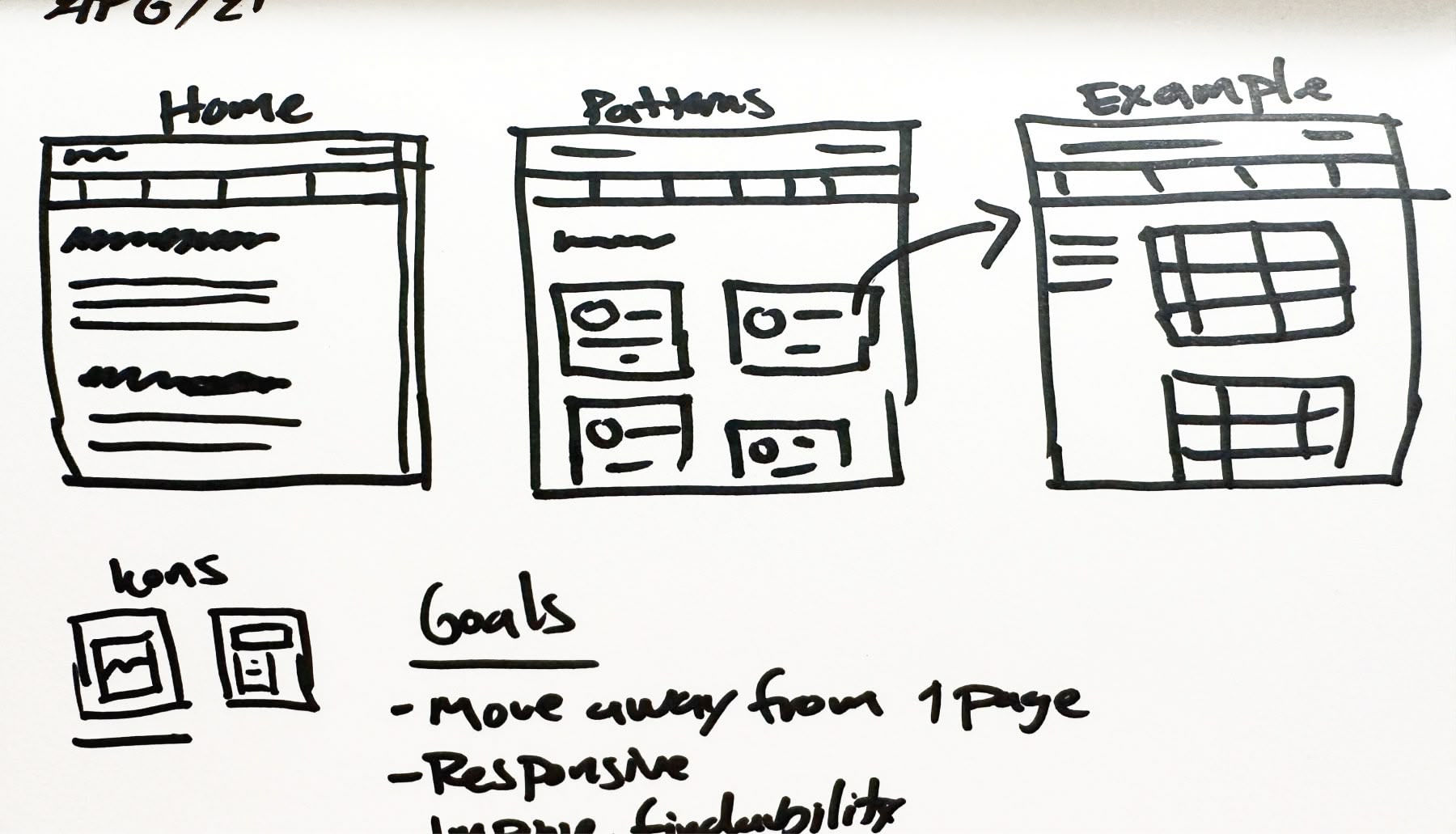
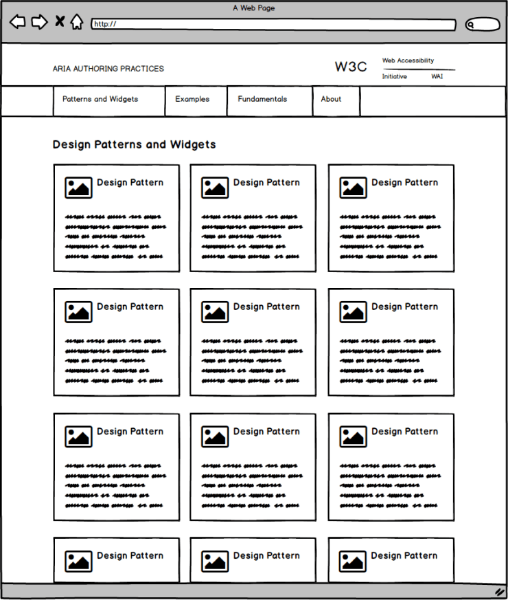
Wireframes
After getting buy-in from my team on my sketches, I created wireframes to help us better visualize how the site would look and help the development team build the first prototype.

Testing and Iterations
With our prototype ready, I conducted our first usability study with 7 participants I recruited through an online survey. I was looking to test the effectiveness of the new information architecture and how easily users could find specific resources.
Insights from the study validated our main assumption: organizing content into sections improved usability. However, the study also highlighted additional user needs, such as the need for a more welcoming homepage and clearer pathways to contribute and provide feedback to the project.
Before
The homepage in the prototype was overwhelming. Testers also found it difficult to find how to contribute to the project.

After
To address this, I redesigned the layout and simplifed its content to showcase the main APG offerings. We also added a dedicated section for how to get involved on the project.
Before
Despite having the design patterns organized as cards. Users still struggled finding the right one when instructed during the Usability Study.

After
To address this, I added a filter mechanism and the option to display patterns as a list to offer a different way to scan the page.
Final Designs and Solutions
Once we validated the new information architecture and iterated on the wireframes based on our findings from the usability study I moved on to work on the high fidelity mockups and site implementation.
Usability
We organized the content into four main sections and defined a new information architecture to structure the APG more effectively.
Findability
We enhanced the findability of APG content through an improved and simplified navigation and filter capabilities for Patterns, the most popular APG resource.
Discoverability
The new APG homepage now serves as a welcoming gateway, featuring diverse resources and clear pathways for users to explore. Additionally, we provide newcomers with a structured starting point to navigate the full range of APG content effectively.
Visibility
We Integrated APG into the W3C Web Accessibility Initiative (WAI), providing a more prominent platform within the accessibility community. This strategic move improved visibility of the APG, seamlessly integrating it into a broader ecosystem of resources, tools, and instructional materials.
Illustrations and Iconography
As part of my work on Visual Design, I also created all the illustrations and iconography for the website.


Impact
Following its launch in spring 2022, the APG website experienced a dramatic increase in traffic. In April 2022, the old site saw 22,000 visits. By July, the new APG attracted over 230,000 unique visitors in a single month. This surge in traffic highlights the improved accessibility, usability, and visibility of the APG following its redesign.