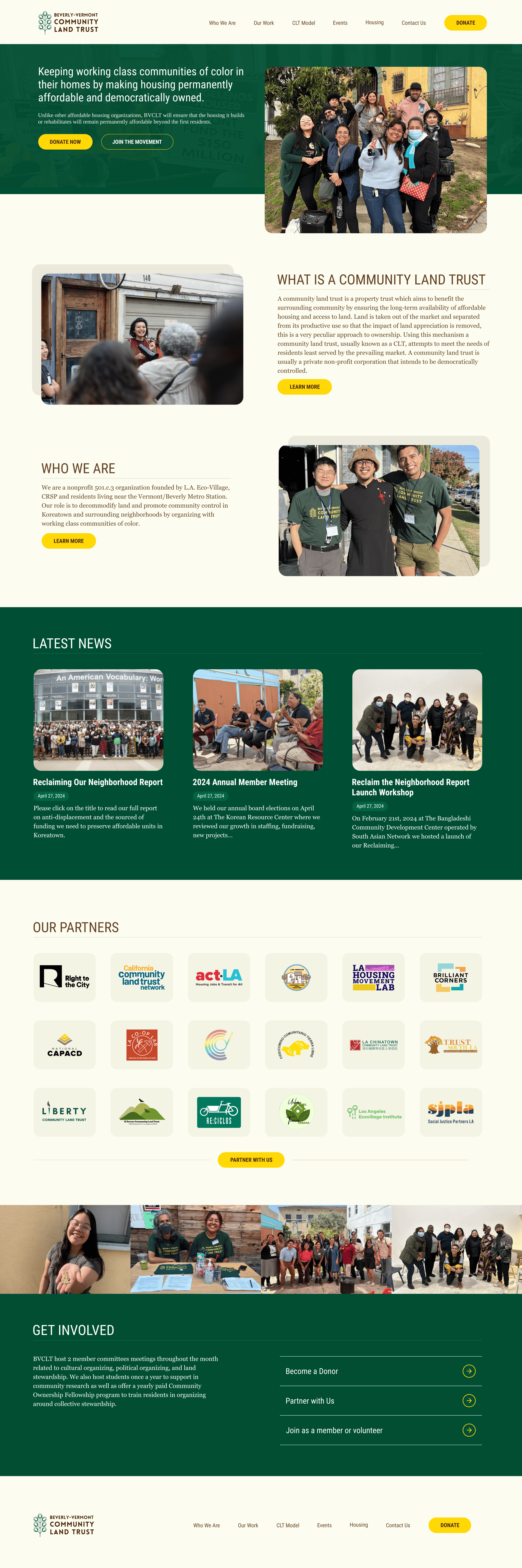
Bvclt.org
A new home for an organization creating permanent affordable housing for working class communities of color.
A Bold and Responsive Homepage
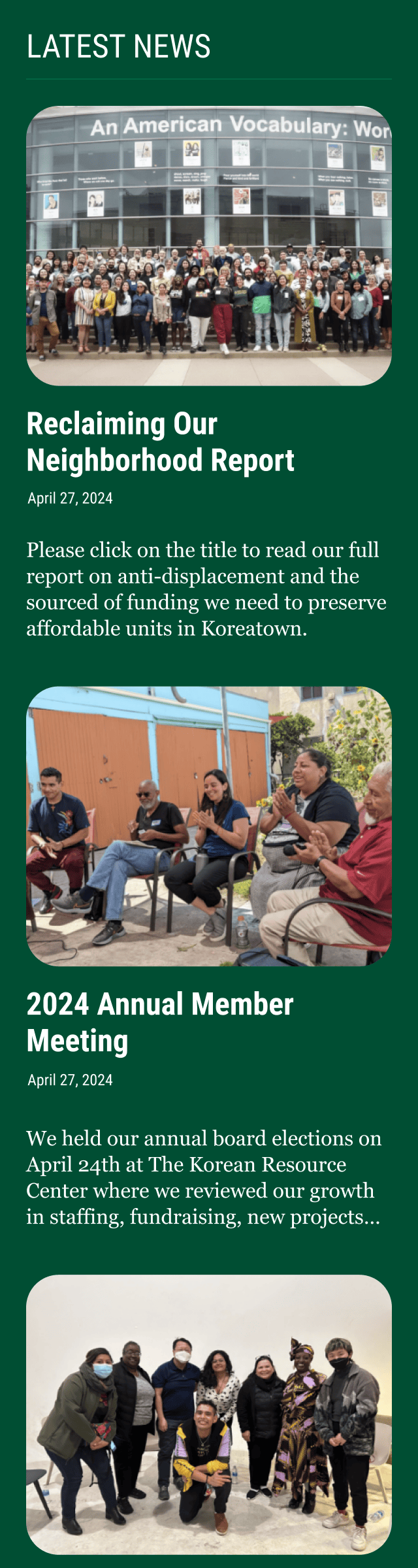
The redesigned homepage for BVCLT is bold and responsive, ensuring that visitors on any device can easily access key information about the organization’s mission and services. Designed to reflect BVCLT’s commitment to creating lasting affordable housing solutions for working-class communities of color, the homepage uses impactful visuals and clear calls-to-action. This layout guides users directly to resources, community stories, and ways to get involved, whether they’re browsing on mobile or desktop.


Intentional Typography
The typography on BVCLT’s website combines the modern, clean lines of Roboto Condensed with the classic, approachable feel of Georgia. Roboto Condensed is used for headings and navigation elements, lending a sense of structure and clarity to the layout. Georgia, with its traditional serif style, brings warmth and readability to body text, enhancing the storytelling aspects of the site. This pairing of fonts balances professionalism with accessibility, reflecting BVCLT’s mission to support communities with both strength and empathy across all screen sizes.

Brand Refinement
To reinforce BVCLT’s identity, I applied a subtle brand refinement that elevated the visual language without straying from its roots. I introduced a cohesive color palette and refined logo usage to better convey BVCLT’s mission of empowerment. These enhancements ensure the site feels both modern and approachable, resonating with the community it serves while reinforcing BVCLT’s commitment to affordable housing and community-led growth.